Universal Visual Editor
dotCMS's interface for editing pages, the Universal Visual Editor (UVE), is a comprehensive, multi-paradigm solution to page editing. From the UVE, you can preview a page; add, edit, or arrange content; adjust layouts; set rules; configure experiments; run workflows; and more.
By providing a unified experience across both traditional and headless contexts — whether editing local or remote pages and web applications — the UVE is one of clearest expressions of dotCMS's hybrid character.
Read more about configuring the UVE to work headlessly in Universal Visual Editor Configuration for Headless Pages, which includes the full specification of the Apps configuration, how to run multiple front ends for development purposes, and general troubleshooting tips.
Please ensure your SDK is up to date. Front-end projects should use the latest published versions of @dotcms/react, @dotcms/types, and @dotcms/uve. This is especially true in the event of upgrading to dotCMS 26.04.20-01 or later, which introduced the UVE Real-Time Canvas.
Toolbar#
Across the top is the UVE's main toolbar, visible while the page content editor is selected in the navigaton bar. It contains the following functions and selectors.
Mode#
The mode selector allows you to switch between Draft, Preview, and Published modes.
-
In Draft mode, the full editing powers of the UVE are available, including the Content Palette. Visible only in draft mode is a glyph to the left of the mode selector that will display or hide the content palette.
-
Preview mode gives you the ability to view the draft version of the page as it would appear across several viewing modes — desktop, tablet, and mobile (in either horizontal or vertical orientation).
-
Published mode is similar to the Preview mode display, but displays the published, rather than draft version — i.e., the version currently visible to site visitors — and also surfaces the Future Time Machine date picker, which allows you to view scheduled versions of the page.
- See the Future Time Machine documentation page for more information.
Preview and Published modes also include an additional dropdown, labeled More, with social media tiles and search engine results pages. These entries provide previews of, and feedback on, your page's behavior in social media linking. This may include checks for best-practice HTML tags, general guidelines, and links for further reading.
Bookmark#
The Bookmark button allows you to bookmark the current page. For more information on bookmarking in dotCMS, see the documentation of the Pages Tool, where they are used.
Copy URL#
The Copy Url button lets you select, via popover, whether to copy the clean version of the URL, or the version with all system parameters.
API#
The API link opens a new tab containing the full JSON object of the current page's Page API response, allowing quick reference to the page's underlying data.
Language Selector#
You can use the language selector to easily switch between different versions of the same page across different defined languages, where available. For more information, see Configuring Languages, or the Multilingual Content section generally.
Persona Selector#
If you're using personalization, this selector allows you to switch between versions of the current page tailored to different personas.
Selecting a visitor Persona sets the Persona on the page, triggers rules, and re-renders the page to display the appropriate personalized content (if any exists).
Visibility or accessibility may vary from persona to persona, based on back-end user permissions.
If a personalized version of a page has only one content item, you will not be able to remove it until you add a new one. This is because persona-specific page content requires at least one contentlet.
Workflow Execution#
The Workflow button allows the execution of applicable Workflows on the current page — such as saving, publishing, or performing more elaborate custom schemes.
The actions displayed will be determined by the Workflow assigned to the Page Content Type, the current Workflow step the content is in, the configuration of the Workflow actions in that step, and your permissions.
Within a given Workflow step, the button's dropdown will display all applicable actions in the same order order in which they appear in the Workflow; the first applicable action is the button's default behavior and label. As such, reordering the actions in the Workflow step can change the default label of the button.
Canvas Zoom#
The canvas zoom control in the toolbar allows you to scale the editor canvas between 10% and 300%. Zooming in is useful for precision work on dense layouts; zooming out provides a full-page view useful for evaluating composition. The current zoom level is displayed in the toolbar and can be reset to 100% at any time.
The toolbar also includes collapsible panel toggles that hide the Content Palette and navigation bar, expanding the canvas to use the full available width.
Content Editor#
The majority of screen real estate in the Universal Visual Editor is the editor window itself, chiefly consisting of a pane displaying an editable preview, including the page's various containers and the content, widgets, or forms they hold.
The UVE is fully compatible with Vanity URLs, and will redirect to load a different page if a Vanity URL is detected for the selected page's URI.
On the pane's right side lies the Content Palette, which allows the quick population of containers.
Editor Window#
Within the editor, each container displays a + button through which you can populate the container with either content, a widget, or a form.
Each container has several buttons that appear when in focus:
| Button | Action |
|---|---|
Shows a list of VTL files relevant to the container's contents — including widget code, the VTL responsible for rendering in the case of a File-Based Container, and any others included through the #dotParse directive. This button will not display if there is no relevant VTL file. | |
| Opens the Quick Edit panel on the right, for rapid editing of basic/common fields in real time. | |
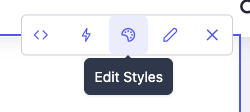
| Opens the Content Style Editor pane on the right, for selection of defined styles. | |
| Click to directly edit the contentlet or widget displayed in the Container. | |
| Remove the contentlet from the container. (This does not delete the contentlet from dotCMS.) | |
| Appears separate from the others, on the left-hand side. Drag this button to reorder content within the container. |
Selecting Contentlets#
Hovering over any contentlet in the editor highlights it with a blue preview overlay. Clicking selects the contentlet, replacing the hover state with a border outline and surfacing its action tools. Both states are non-blocking — the underlying page remains interactive, so links and embedded interactive elements continue to function normally.
The Content Palette#
Clicking on any displayed Content Type in the Content Palette provides a list of contentlets of that type.
Drag and drop any item from this list to place it into a container. Alternately, you may drag and drop the Content Types themselves to create a new contentlet of that type and immediately place it in the container.
The Content Palette allows text searches for content types, and filtering between content types, widgets, favorites, and styles via the top-row tabs.
Content Palette Displayed Types#
The Content Palette automatically shows all Content Types accepted by the Containers in the Page, as well as up to 100 widget types.
You may optionally exclude Content Types from the Content Palette, even if a Container would otherwise accept them, by assigning a comma-separated list of Content Type variables to the following environment variable (shown below in its default state):
DOT_CONTENT_PALETTE_HIDDEN_CONTENT_TYPES: 'Host,Vanityurl,Languagevariable,persona,forms'
Layers Panel#
The Layers panel includes a hierarchical tree view of the page's Rows and Columns, with real-time drag-and-drop reordering and visual feedback. Container labels display a full-title tooltip on hover when their name is truncated.
Content Style Editor#
The Content Style Editor lets authors select dynamic style properties on individual contentlets directly from the UVE — for both traditional (VTL) and headless pages. Once a Content Type's style schema is configured, no code is required to restyle within the available selections.
The style-editor button (with the palette icon) opens the Style Editor pane and displays its configurable properties.
Schemas are configured per Content Type in the Content Types portlet under the Style Editor tab, with no code required. For full details on building schemas, field types, VTL integration, and headless consumption, see Content Style Editor.
Styles are associated with specific contentlets within specific container types on a page:
- Moving a styled contentlet between two containers of the same type preserves its configured styles.
- Moving a contentlet to a different compatible container type, or removing and re-adding a contentlet, requires reselecting its styles.
On traditional pages, saving a style change triggers an immediate backend save followed by an automatic page reload. On headless pages, changes appear in real time via postMessage, with the backend save deferred briefly and no reload required.
Quick Edit Panel#
Clicking a contentlet in the editor opens the Quick Edit panel, a lightweight side panel displaying the most commonly edited fields for that content, such as title, image, caption, and links. Changes appear in real time in the canvas as you type or update values, with a debounced auto-save writing to the backend without requiring manual action.
The panel provides Cancel and Save buttons. Clicking Cancel restores all fields to their last saved state. An Open Full Editor link is also available for accessing the complete contentlet form when advanced fields are needed.
On headless pages, Quick Edit updates appear in the iframe immediately via postMessage with no page reload. On traditional pages, saving triggers a page reload, consistent with other content edits in the UVE.
The Quick Edit panel is available in Draft mode only.
Navigation Bar#
Appearing on the far right-hand side of the UVE is perhaps its most fundamental menu, as everything discussed above falls within the scope of its first item — Content.
At the far right of the UVE display, a sequence of tabs allow navigation between different page-specific editable parameters:
| Icon | Action | Description |
|---|---|---|
| Content | Allows you to add and modify the content displayed on the Page. | |
| Layout | Allows you to modify the layout of the Containers in the Page, to create a custom layout as though it were a Template. | |
| Rules | Displays and allows you to add and edit Rules that apply to this Page only. | |
| A/B | Views the page's Experiments. | |
| Page Health | Provides a panel of links to built-in scanners and third-party tools that assist with best-practices compliance, including a GEO readiness score and an accessibility compliance check. | |
| Properties | Opens the page properties via the contentlet editor. | |
| Page Health | Provides built-in scanners that audit the current page directly within dotCMS — currently . |
Page Tools#
The Page Tools pane opens a popup, seen below, that includes built-in tools and convenient links to external services that can help evaluate a page for accessibility, security, etc.
Accessibility Scanner#
The Accessibility card runs an automated audit of the page's rendered HTML against WCAG 2.1 AA criteria using the Axe JavaScript library — the technical standard underlying ADA compliance (United States), AODA (Canada), and the European Accessibility Act (EU). Results are displayed in a report dialog organized by severity: errors, warnings, and best-practice notices, each with actionable remediation guidance.
GEO Scanner#
The GEO card audits the page for readiness to be discovered, cited, and surfaced by AI answer engines such as Perplexity, ChatGPT, and Gemini, as well as traditional search. It returns a 0–100 composite score derived from 20 signal checks across four weighted categories:
| Category | Weight | What it evaluates |
|---|---|---|
| Citability | 30% | Source citations, statistics, expert quotations, content depth, and answer structure |
| Structured Knowledge | 25% | Schema presence, validity and completeness, heading hierarchy, and internal linking |
| Content Authority | 25% | Author attribution, publish date, image alt text, title uniqueness, and HTTPS |
| Discoverability | 20% | Meta description, canonical tag, indexability, Open Graph tags, and language declaration |
Issues are surfaced as high (score of 0), medium (score below 40), or low (score below 70), sorted by severity, each with a specific remediation message.
Private URLs and Local Instances#
Both scanners call an external API with the page's URL. If the current page is hosted at a private or local address — including localhost, 127.0.0.1, RFC-1918 IP ranges, or .local domains — the scanner detects this before making any call and presents a consent gate explaining the security implications. From there, it provides instructions for exposing the page via a Cloudflare tunnel so the scanner can reach it. The consent gate resets each time the dialog is closed.
The GEO Scanner analyzes rendered HTML. Pages that rely entirely on client-side rendering may return a partial score. Server-side rendering is recommended for pages intended to be discoverable by AI engines and search crawlers.
Third-Party Tools#
By clicking any of these entries, your page URL — if published and live — will be automatically fed into the respective tool. Each of the entry listings is a uniform link; the "chips" at the bottom of each convey the categories addressed by each tool.
-
WAVE®'s tools help to identify accessibility issues — whether structural, such as header usage; graphical, such as color contrast scores; or notational, such as the presence or absence of alt text on images.
-
Mozilla Observatory scans for cookie usage, security policy, and more, across several web protocols. It also includes third-party scans for, e.g., other high-profile vulnerabilities.
- For more information, see their FAQ.
-
Security Headers provides feedback on absent or improperly configured security headers.
- For more information, see their FAQ.